Published
- 7 min read
Understand All About Flex Container
Introduction
Flexbox is short for Flexible Box Module which is used for arranging HTML elements flexibly rather than having rigid boundaries.
For example, if you need to display a list of products for an e-commerce webpage the number of products sitting in a row would change as per the resolution of the webpage.
Mobile screens could show one item per row whereas large desktop screens could show up to four or five products per row.
We don’t want the parent element that contains these product images and descriptions to be rigid with respect to its dimensions.
We would want the parent container element to resize itself and fit in a given number of products per row for different screen sizes.
That’s when Flexbox shines.
Let’s see how to use this layout method in CSS.
Flex Container
When using flow layout you can position elements using inline, block or inline-block as the display property’s value.
In the same way, you can use display: flex to convert an element in the flow layout to a flexbox container.
The ‘flex’ value in the display: flex property is short for block-flex, the element it’s applied to behaves like a block-level element.
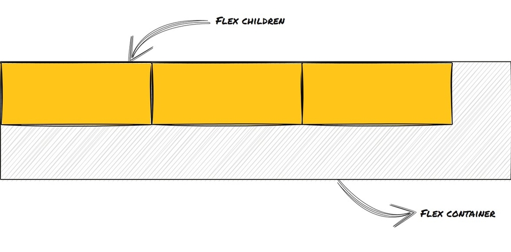
The element which has the display property set to flex is referred to as the flex container and its children are called flex children.
Applying display: flex to an element does not reposition the element itself but re-arranges its child elements.
The child elements stack up together in a row side-by-side unless there’s any margin applied to space them out.
Here’s how we would apply the flex property to a div.
       div {
	display: flex;
}
Flex container and flex children with display value flex. Illustration by the author.
As soon as an element is converted to a flex container it’s automatically assigned two axes called the main axis and the cross axis.
The beginning and end of both of these axes are referred to as start and end rather than top/bottom or left/right.
The positions of start and end respect the writing mode of the document(right-to-left or left-to-right).
The default axes position is horizontal for the main axis and vertical for the cross axis.
You can also change it to have a vertical main axis and a horizontal cross axis.
 Horizontal main axis and vertical cross axis. Illustration by the author.
 Vertical main axis and horizontal cross axis. Illustration by the author.
You can change the positions of these axes by using the flex-direction property for the flex container.
The flex-direction property can have the following values:
-
row - This is the default value. The main axis is horizontal and the cross axis is vertical.
-
row-reverse: The main axis is horizontal and the cross axis is vertical. The elements are arranged in a reverse fashion.
-
column - The main axis is vertical and the cross axis is horizontal.
-
column-reverse - The main axis is vertical and the cross axis is horizontal. The elements are arranged in a reverse fashion.
       div {
	display: flex;
	flex-direction: row;
}
Note: When using row-reverse or column-reverse only the display order of the items is changed and not the logical order. This can cause issues with accessibility.
 Flex direction row. Illustration by the author.
 Flex direction row reverse. Illustration by the author.
 Flex direction column. Illustration by the author.
 Flex direction column reverse. Illustration by the author.
Flex-wrap
In case we don’t want all the elements to stack up in a single row/column we can use the flex-wrap property to make sure that they split across multiple rows/columns.
Each row/column then becomes a separate flex container.
Flex wrap accepts the following values:
- nowrap: Flex children will not wrap to the next row or column depending on the flex direction (Default).
- wrap: Flex children will wrap to the next row or column depending on the flex direction.
- wrap-reverse: Flex children will wrap in reverse order. Only display order is reversed and not the logical order.
div {
display: flex;
flex-direction: row;
flex-wrap: wrap;
}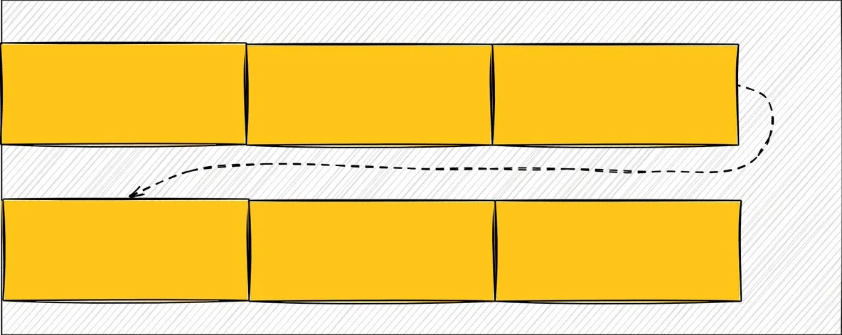 Flex wrap for flex direction row. Illustration by the author.
Justify-content
Justify-content is used to decide how to arrange the flex children along the main axis of the flex container.
justify-content can accept the following values:
- flex-start: Flex children are pushed towards the start of the main axis(Default).
- flex-end: Flex children are pushed towards the end of the main axis.
- center: Flex children are centered along the main axis.
- space-between: Flex children are positioned along the main axis so that there is more space between the flex children themselves than the space between the flex children and the flex container.
- space-around: Flex children are positioned along the main axis so that there is more space between the flex children and the flex container than the space between the flex children themselves.
- space-evenly: The space between flex children themselves and the space between the flex children and the flex container is the same.
       div {
	display: flex;
	flex-direction: row;
	justify-content: flex-start;
}
Justify content using flex start with flex direction row. Illustration by the author.
 Justify content using flex end with flex direction row. Illustration by the author.
 Justify content using center with flex direction row. Illustration by the author.
 Justify content using space between with flex direction row. Illustration by the author.
 Justify content using space around with flex direction row. Illustration by the author.
 Justify content using space evenly with flex direction row. Illustration by the author.
Align Items
To decide how to arrange the elements along the cross axis we can use align-items.
align-items can accept the following values:
- flex-start: Flex children are pushed to the start of the cross axis(Default).
- flex-end: Flex children are pushed to the end of the cross axis.
- center: Flex children are aligned to the center with respect to the cross axis.
- baseline: Flex children are arranged in a way so that their baselines line up with each other.
- stretch: Flex children occupy the entire width available to them along the cross axis while respecting their own width dimensions.
div {
display: flex;
flex-direction: row;
align-items: flex-start;
}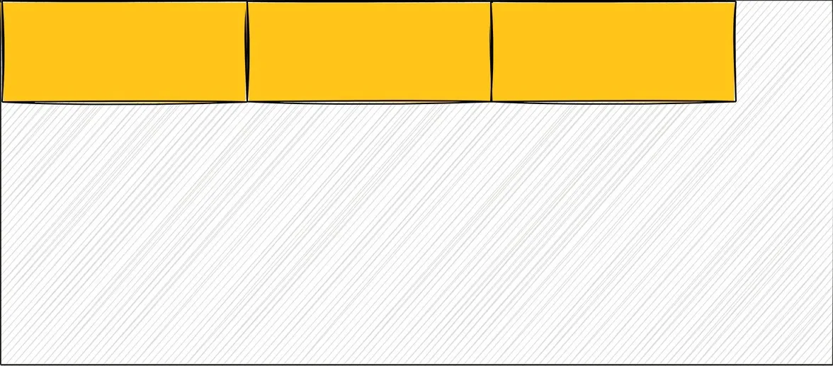 Align items using flex start with flex direction row. Illustration by the author.
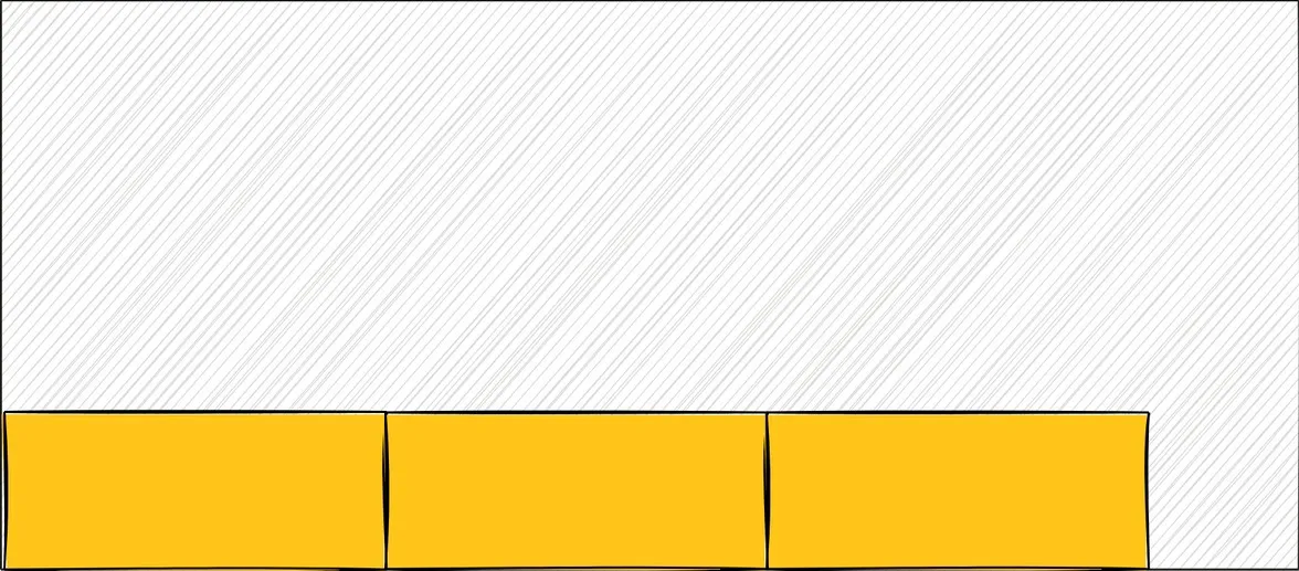 Align items using flex end with flex direction row. Illustration by the author.
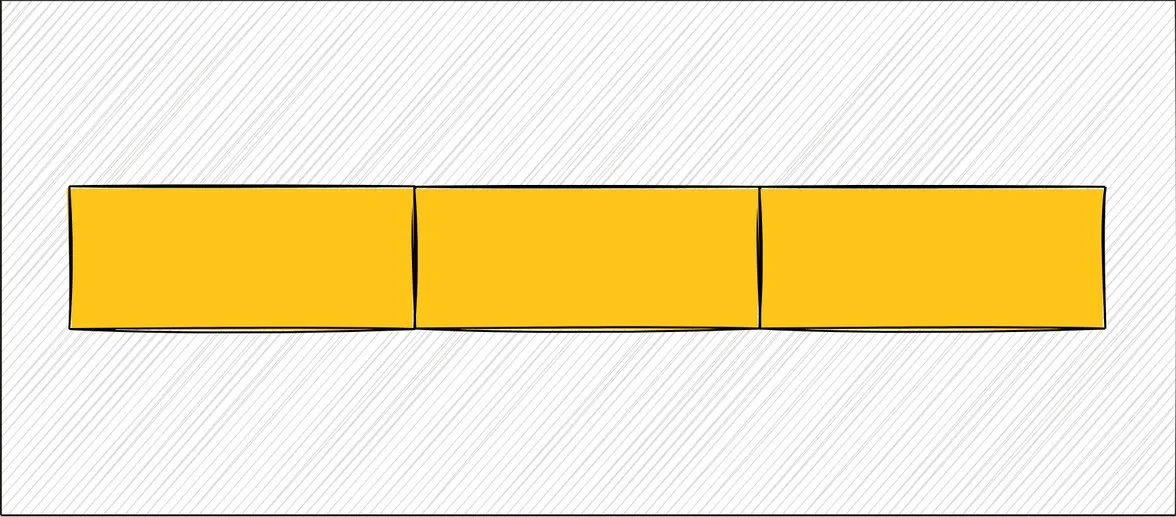 Align items using center with flex direction row. Illustration by the author.
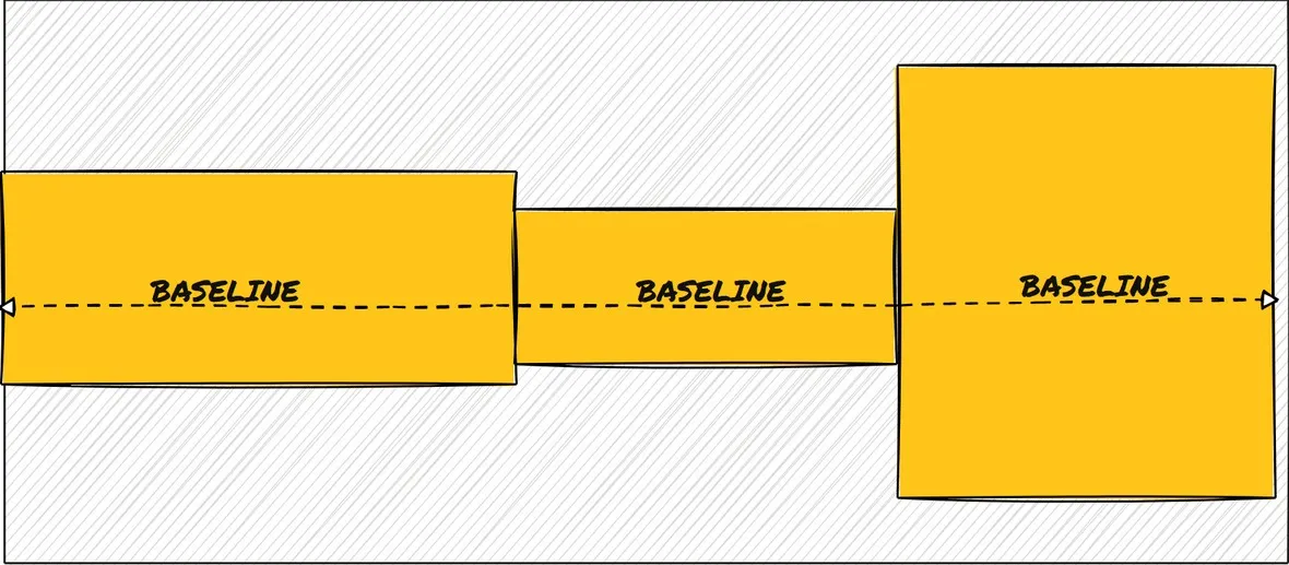 Align items using baseline with flex direction row. Illustration by the author.
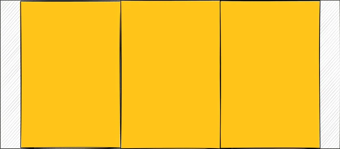 Align items using stretch with flex direction row. Illustration by the author.
Align Content
Align-content has effect only when the flex-wrap property is set to wrap. It distributes the space between rows or columns of the wrapped items. Each row/column of the wrapped items is treated as a separate flex container. Align content positions the elements along the cross axis of the flex container.
align-content can accept the following values:
- flex-start: The rows/columns are pushed to the start of the cross axis.
- flex-end: The rows/columns are pushed to the end of the cross axis.
- center: The rows/columns try to center themselves along the cross axis.
- space-between: The rows/columns have maximum space in between them.
- space-around: The rows/columns have maximum space around them with respect to the flex container.
- space-evenly: The space between the rows/columns and the flex container is distributed evenly.
       div {
	display: flex;
	flex-direction: row;
	align-items: flex-start;
}
Note: The distribution of the space is done respecting the height and width dimensions of the flex children in each row/column.
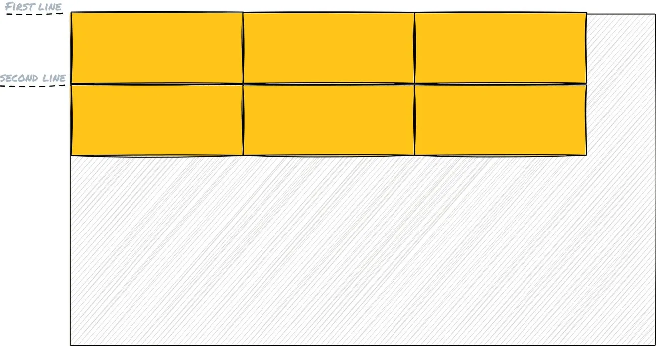 Align content using flex start with flex direction row. Illustration by the author.
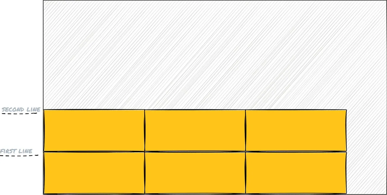 Align content using flex end with flex direction row. Illustration by the author.
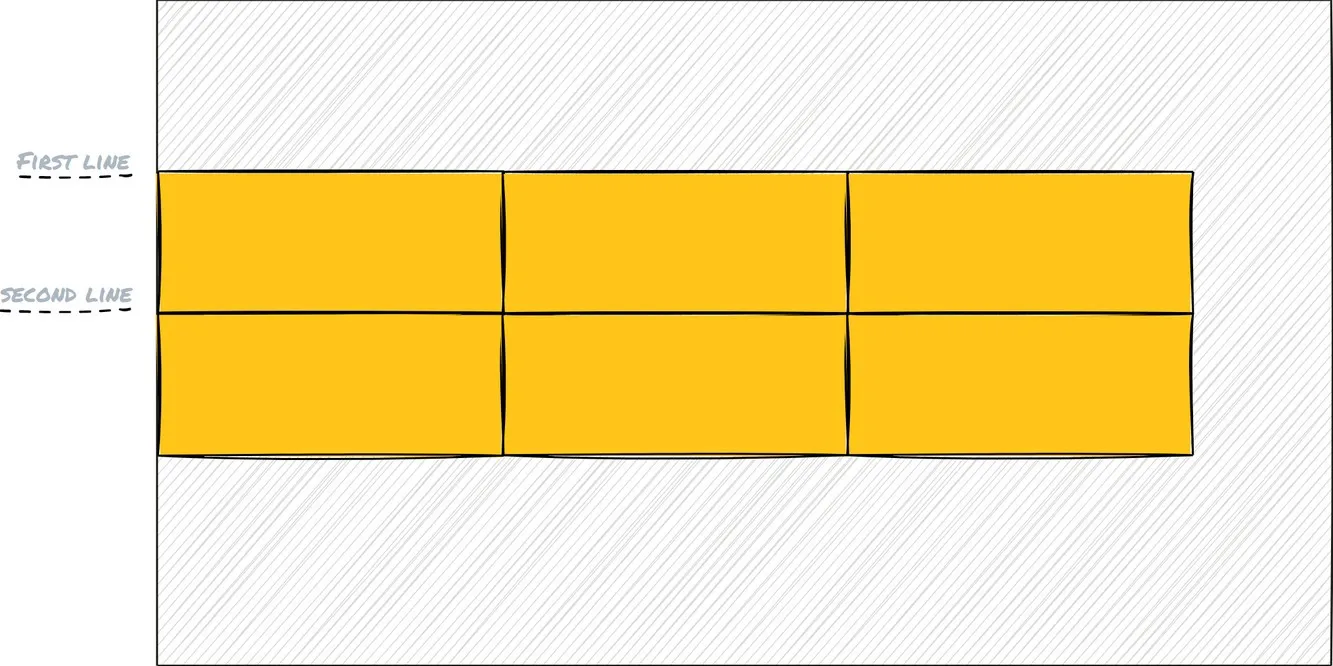 Align content using center with flex direction row. Illustration by the author.
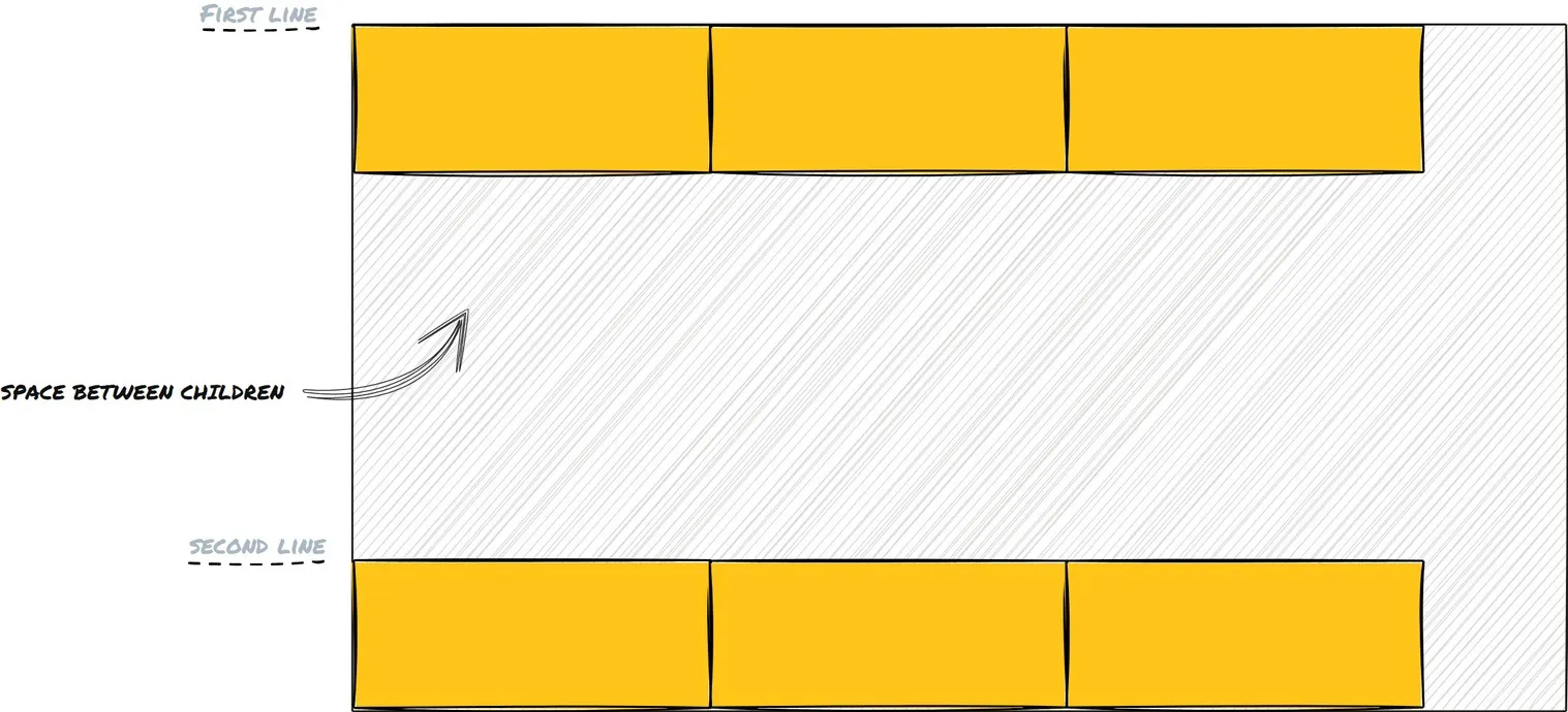 Align content using space between with flex direction row. Illustration by the author.
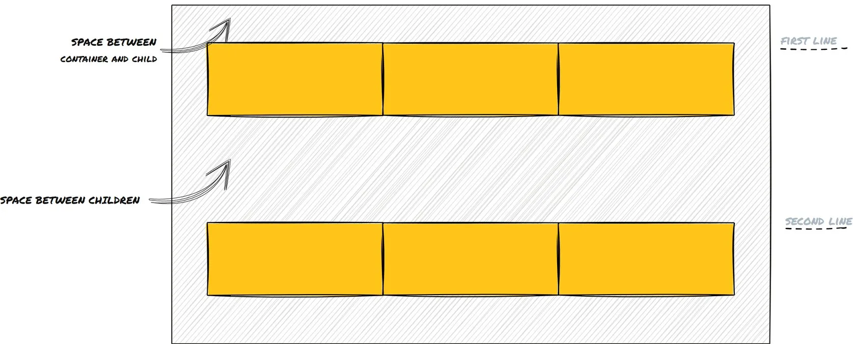 Align content using space around with flex direction row. Illustration by the author.
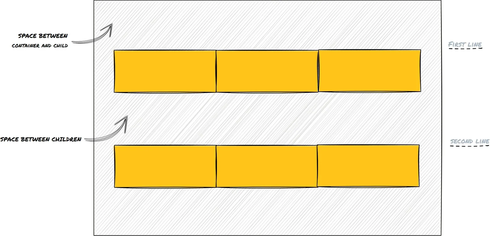 lign content using space evenly with flex direction row. Illustration by the author.
Takeaway
I hope this article has given you a gist regarding how powerful a flex container is and what all amazing superpowers it does have. Layouts have never been simpler in CSS all thanks to flexbox.
If you want to dive deeper into the nitty-gritties of flexbox I recommend checking out the links in the references.
Till then, Happy Coding!