Published
- 7 min read
What is the EM unit in CSS?

As a web developer, it is quite possible to have come across the em unit in CSS.
It is one of the most used units for responsive design.
Some say it’s confusing, some are devoted fans, and others don’t bother about it at all.
I found ems mysterious and decided to go on a quest.
A quest to understand ‘What are ems and where did they come from?’
To find the answers to my questions, I decided to travel to the past.
History of Ems
The origins of em go back to typography when printing processes used wood and metal blocks to create letters on paper.
Each letter had a predefined container of metal or wood around it.This container had a fixed height with different widths depending on the font.
The font designer decided the dimensions of the container. This container was called the Em(Ephemeral) Box.
 Photo by Fabio Santaniello Bruun from Unsplash
Alright, but what has all this to do with em?
Em, my friend is nothing but the height of the em box.
So, 1em = height of the em box(whatever number that might be.
Cool. So what does this mean for digital fonts in our browsers?
Let’s move to our next stop, the future, to understand it.
Em in the digital era
We don’t use metal or wood blocks for digital fonts in this modern age, but the em box still exists.
Each letter of a digital font has an imaginary em box around it.
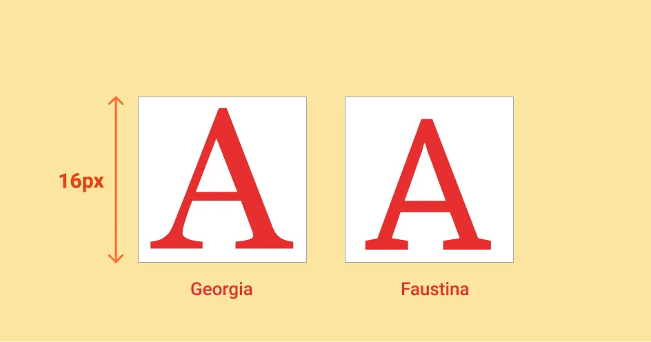
And the height of that em box is decided by your font size.
 Georgia and Faustina set at the same font size. Illustration by the author.
For example, here, we have two fonts, Georgia and Faustina.
Despite being at the same pixel size, you might notice a difference in the dimensions of the letter A for both fonts.
And that’s the catch here.
The font size you set when using ems is not the height of the font’s character but the height of the em box.
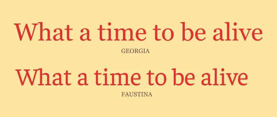
That’s why you might see a variance in the sizes of the words even when set to the same font size.
 Georgia and Faustina display differences in sizes despite being the same font size. Illustration by the author.
Now that we understand the meaning of em, let’s see its use in HTML.
Em for the Web
In the web world, em is still the height of the em box.
But who decides the height of the em box for the web fonts?
The height of the em box is said to be relative, and it always depends on the font size inherited from its direct parent.
Err..what?
As code speaks louder than words, let’s look at a couple of code samples.
Case 1: Parent element has a default font size
       .text {
	font-size: 2em;
}
In the above code sample, we have a DOM tree of elements like:
<html> → <body> → <div>
Across this tree, the <div> element is the only one with a specified font size equal to 2em.
Its direct parent, the <body> element, does not have an explicitly set font size and neither does the <html> element.
If you recall, we said earlier that the em is a relative unit that depends on inheriting the font size from its direct parent element.
There is no font size specified for the direct parent in this case, at least explicitly.
So what happens now?
The <body> element currently inherits its font size from the <html> element, which in turn gets its font size from the browser’s default settings.
Usually, the browser defaults to 16px (although you can always change it as needed).
Using the defaults,
the font size of the <div> element
= direct parent’s default font size * 2
= <body> default font size * 2
= 16px * 2
= 32px
In retrospect, the <div> element ended up using the browser’s default settings for font size.
Let’s see what happens if the direct parent element has a font size specified.
Case 2: Parent element has an explicitly set font size
       body {
	font-size: 2em;
}

.text {
	font-size: 2em;
}
Continuing with the previous code sample, our DOM tree of elements still stays the same as,
<html> →<body> →<div>
With <body> and <div> elements each set to 2em.
You might observe, the same <div> which contains the text appears larger now even though we haven’t changed its font size. Instead we have just specified one for its parent. To know why this happens let’s have a look at the calculations below.
the font size of the <div> element
= parent’s font size * 2
= <body> font size * 2
= <html> font size _ 2 _ 2 (<body> font size = <html> font size * 2)
= 16px(browser default) * 4
= 64px
Aha, the font size for the <div> element is now four times the font size of the <html> element.
That is why the content of the <div> element has become huge.
And this is where the trouble starts.
Problems with Em
As you saw in the previous code samples, the text size was magnified by just increasing the font size of its parent element.
You could imagine a scenario wherein we have a tree of DOM elements, and each element in the tree had its font size specified.
The sizing effects wouldn’t take long to snowball down the tree resulting in enormous font size for the last element.
To counter these effects, we have a savior — the rem.
Birth of Rem
Rem short for Root em or Root Ephemeral is a relative unit that specifies a font size for the root element, which is nothing but the <html> element.
If the <html> element itself does not have a font size specified explicitly, then the browser’s default font size is considered.
The elements in the DOM tree ignore their parent’s font size, and the root element serves as a touchpoint for all elements.
Let’s look at a code sample to get more clarity.
In the code sample above, the DOM tree remains the same
<html> →<body> →<div>
With the the <body> element set to 3rem and the <html> element set to 1rem.
Could you guess what will be the font size for the <div> element now?
Considering browser’s default font size as 16px,
1rem = 16px
So,
font size of the <div> element
= font size of the root element(<html>) * 2
= 32px
Yep. Even though the direct parent element of the <div> element which is the <body> element has a font size specified, the <div> still uses the root element’s(<html>) font size to calculate its value.
Now that we better understand em and rem, it’s time to know when to use which one.
Em vs. Rem — When to use which unit
There is no one size fits all approach for using em and rem. The use of both of these units depends on your goals.
If all you need is the children’s elements to scale as their parent elements change their sizes, go with em.
Use rem if you want a fixed point of reference for the children elements to scale and keep the behavior predictable.
Em and rem are different units but what IS common for both is that they will help you add responsiveness for different resolutions in your design.
You could try experimenting with both of these units and then decide which one works the best for you. Eventually, it boils down to personal preferences.
That’s it, folks. I hope this newfound understanding of em and rem will help you better use them and support you in building responsive designs.
If you have any questions, comments or suggestions, feel free to drop them in the comments below.
Till then,
Happy Coding!
References
-
On Web Typography — Jason Santa Maria
-
The Em Box
-
Em vs. Rem